About two years ago, I stumbled across another author's blog, and she had just designed her own cover to her fantasy short story. I was impressed. She said that she had designed the cover in GIMP, which is basically a free program that does most of what Photoshop can do--if you have the tenacity to learn it.
Well, I like a good challenge. I decided to start designing my own book covers, just to see if I could do it. If it was terrible, well, I could always fall back on indie cover designers.
So I downloaded GIMP and started to teach myself how to use it.
Well, I like a good challenge. I decided to start designing my own book covers, just to see if I could do it. If it was terrible, well, I could always fall back on indie cover designers.
So I downloaded GIMP and started to teach myself how to use it.
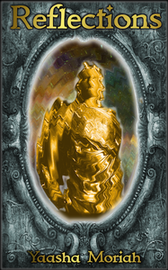
When I released REFLECTIONS in November 2014, it sported the most complex cover I was capable of. I had just figured out how to get a glow around an object (the mirror) and how to create a ripple effect. Something about the cover felt flat, but I wasn't capable of better and I didn't have the money to pay someone to create a more spiffy cover, since I'd just had to quit one of my jobs due to my chronic illness.
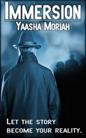
Several months later, I released IMMERSION, and the result was pretty much the same thing. This time, I'd figured how to use the airbrush and I really liked the man in the raincoat. It seemed to fit Cerberus' mysterious character well, although something in the back of my mind nagged me. Doesn't that look a little like a 1900s mystery story?
Several months later, I released IMMERSION, and the result was pretty much the same thing. This time, I'd figured how to use the airbrush and I really liked the man in the raincoat. It seemed to fit Cerberus' mysterious character well, although something in the back of my mind nagged me. Doesn't that look a little like a 1900s mystery story?
 |  |
I wasn't entirely happy with my covers, but I felt trapped by my lack of skill and my lack of money. Not a super combination. And, being the bull-headed person I am, I just got mad. Who said I couldn't be both an author and a designer? Maybe it would take longer--okay, a lot longer--than I expected, and maybe I'd eventually have to admit that graphic design wasn't in my skill set, but there was no reason I couldn't learn everything I could.
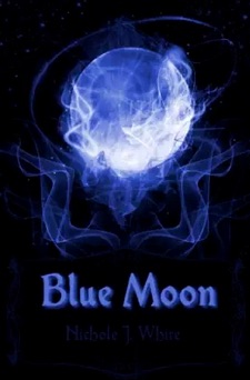
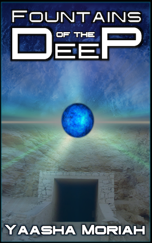
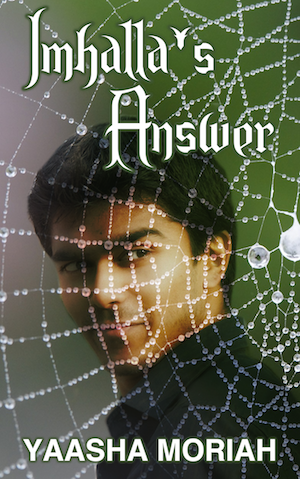
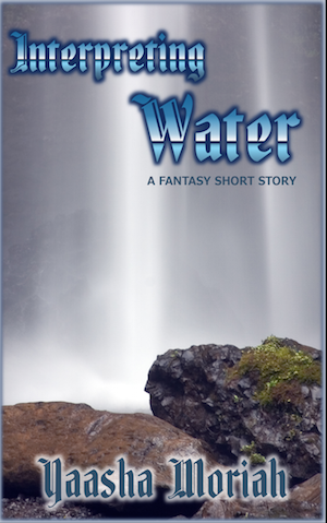
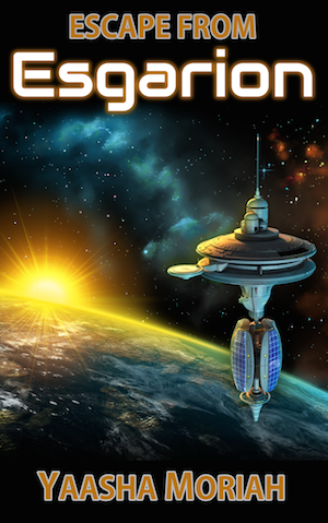
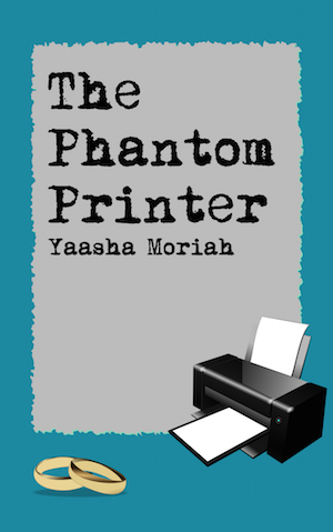
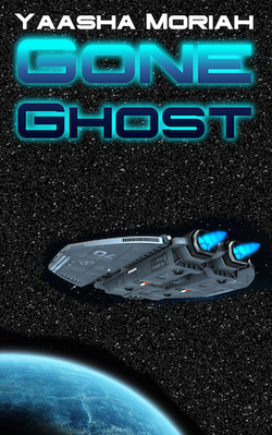
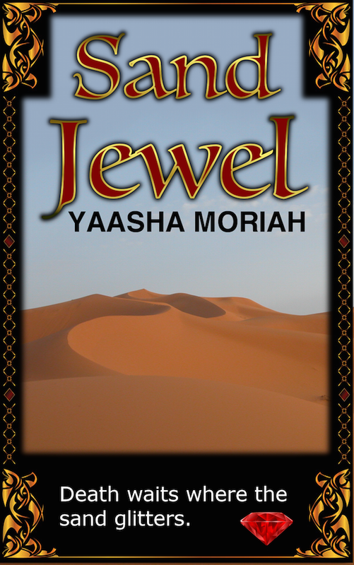
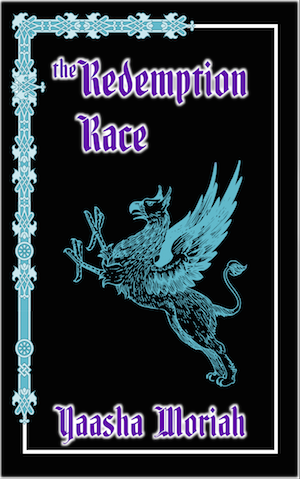
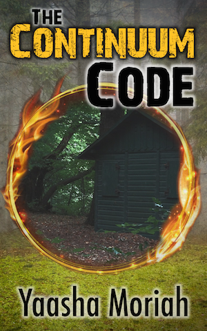
So I bookmarked a bunch of videos on YouTube that taught various features of GIMP, and I practiced the heck out of the program. Here are some of the cover designs I created, in order of creation (from left to right).
So I bookmarked a bunch of videos on YouTube that taught various features of GIMP, and I practiced the heck out of the program. Here are some of the cover designs I created, in order of creation (from left to right).
  |   |   |   |   |
Okay, so what have I learned about cover designing over the last two years, and what tools did I have available?
Important Cover Designing Tips
- Make it colorful. People expect covers in the fantasy and sci-fi genres to pop. If you notice, IMMERSION is extremely one-note. One color, lots of shadow... ick. Not exciting. REFLECTIONS is similar. I got in two colors (woohoo) but there's nothing attention-grabbing about the design. It's just kind of: "Look, I warped a picture of a golden angel and slapped it inside a frame." (Which is pretty much what I did.) So, you'll notice that there's a lot more color in my later covers. (Instead of various shades of blue. I didn't know I liked that color so much.)
 Boring |  Interesting |
- Identify the genre by the main graphic. Again, IMMERSION fails miserably in this respect, since the guy in the raincoat looks like some villain from a 1900s mystery story. Not quite the genre I was aiming for. PROJECT MINERVA is better at identifying its genre. The binary code and glowy green lettering is a giveaway that shouts: "Sci-fi, anyone?" I get a lot of my free graphics from Pixabay.com, Stocksnap.io, Morguefile.com, and Creative Commons sources. Occasionally, I'll buy stock images from Dreamstime or (my favorite) CanStockPhoto.
 |  |
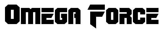
- Identify your genre by font. Just in case the picture ain't clear enough, make sure the font pulls its weight in categorizing your story. I get tons of free fonts from 1001freefonts.com. If you're going for fantasy, here's some favorites:
 |  |  |
 | 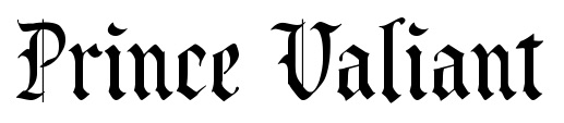 |
If you're going for sci-fi, here are some good picks:
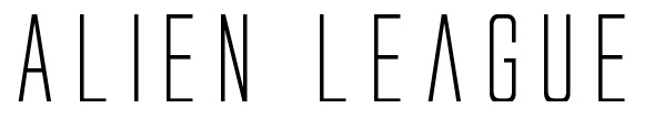 | 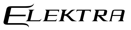 | 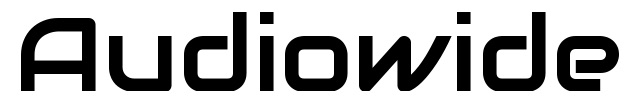 |

 |  |
- Suggest action. Okay, break with form here and just scroll down to see my updated covers for REFLECTIONS and IMMERSION. I want you to view the difference. Notice that in both "before" covers, the main subject is just standing there like a blob. There is no suggested action. In both "after" covers, you feel like you snapped a frame of a movie at the point where something was happening. The sword-wielder is emerging from the mirror, and the mysterious figure is approaching in a hurricane of other-worldly essence. People love action. Don't you?
- Optimize the cover as a thumbnail. In other words: On Amazon.com or any other web seller, your cover is going to be small...just a quick flash of color as a potential buyer is scrolling down the page. So make the design simple enough and big enough to be recognizable.
My two updated covers
So this week, realizing that I now had better resources and skills, I decided to revamp the covers of REFLECTIONS and IMMERSION. Guys, I am pretty seriously pleased with myself right now!
 BEFORE 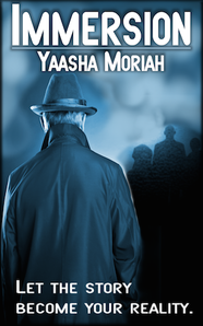 BEFORE | 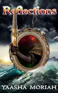 AFTER 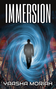 AFTER |
Let me know what you think of the transformation in the comments below! Also, which of the 5 tips is most useful for you? Let me know!
 RSS Feed